The most fashionable interior colors in 2025
The most fashionable interior colors in 2025? Discover earthy beiges, muted greens and pastel blues – plus expert tips for designers, contractors and investors.
TRENDS & INSPIRATION
7/10/20256 min read


Calm and tranquillity
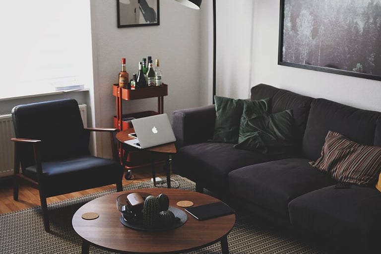
In 2025, interior designers, architects and paint manufacturers are unanimously turning to nature-inspired colour palettes. Instead of bold contrasts and cool industrial tones, warm, muted shades are making a comeback. It's a response to the growing need for calm, relaxation and regeneration – not only in homes, but also in commercial spaces.
Earth, Wood and Warmth – Grounding Tones
In the 2025 colour palette, earthy shades clearly dominate – colours inspired by nature, the landscapes of southern Europe, clay houses, desert sand, or charred wood.
These include:
terracotta, caramel, cinnamon, ochre – warm tones reminiscent of burnt brick, spices and clay pots
warm beiges and browns – evoking sand, tree bark, nuts and linen fabrics
These colours bring a sense of calm and rootedness to interiors. They’re associated with permanence, familiarity, and safety. They work perfectly in living rooms, kitchens and shared spaces where people seek comfort and stability.
When combined with light wood, black accents (such as mirror frames, lamp fittings, handles), and textures of natural materials, they create interiors that are both elegant and cosy. This is a style that ages well – immune to fleeting trends yet still feeling modern.
From a designer or contractor’s perspective, earth tones are extremely versatile – they suit both classic and minimalist interiors. They can serve as a backdrop for bold accessories or take centre stage in Mediterranean, boho or Japandi-inspired designs.
Green as a Symbol of Balance
The second standout trend for 2025 is muted green – soft, slightly dusty tones that are understated yet distinctive.
These include shades like:
sage
olive
eucalyptus
lichen green
forest moss
These colours are deeply tied to nature – evoking damp forests, healing herbs, morning mist and the stillness of a mountain floor. They have a calming, soothing effect – both visually and emotionally. Ideal for spaces where focus, calm and long-term comfort are important.
Greens pair beautifully with wood, stone and architectural concrete, as well as with natural fabrics like linen, wool and raw canvas.
They work well in:
home offices – aiding focus without being distracting
bedrooms – creating a peaceful, restful vibe
bathrooms and wellness areas – enhancing a spa-like, fresh atmosphere
kitchens – increasingly replacing greys in cabinet fronts
In 2025, green is not a flashy trend but a conscious choice – a background for natural light, soft textures and harmonious details. Interiors built on this palette are enduring not just physically, but emotionally – they continue to feel right for years to come.
Pastel Skies and Smoky Blues
In this year’s colour trend reports – from Pantone’s Color Trend to Dulux Colour Futures and Tikkurila palettes – there’s a clear return to soft blues and greys with a misty, diffused quality. These aren’t cold, industrial colours, but pastel, subdued ones – reminiscent of morning skies, soft clouds and gentle daylight.
Noteworthy shades include:
baby blue
grey blue
lavender grey
These colours evoke feelings of hope, clarity and serenity. They symbolise a breath of fresh air after challenging times – openness to new beginnings, and a desire for calm without sacrificing elegance.
They work particularly well in:
bedrooms and relaxation zones – where they promote a soothing atmosphere
children’s rooms – as an alternative to bright, overstimulating colours
small apartments and studios – where they help to visually enlarge the space
Combined with white, light wood, linen textiles and glass, they produce an airy effect and a sense of modern minimalism that doesn’t overwhelm and ages gracefully.
Importantly for designers and contractors: pastel blues adapt well to different lighting conditions – both natural and artificial – making them a safe and timeless choice for clients seeking longevity and tranquillity in their interiors.


Tone-on-Tone – A Play of Shades Instead of Contrasts
One of the most intriguing interior design trends of 2025 is the “tone-on-tone” principle – combining several shades of the same colour within a single arrangement. This approach replaces traditional contrasts with a more refined and cohesive visual effect.
Examples include:
pastel blue paired with navy and grey-blue textiles
olive green walls matched with moss-green curtains and sandy-toned accents
The result? A space that gains depth, rhythm, and a clear colour direction – without feeling overwhelming. It’s not about monotony, but about subtle variations within a single colour family, adding elegance and a professional touch to the design.
The tone-on-tone approach:
works perfectly in minimalist interiors where form and light take the lead
is a natural choice for japandi, Scandinavian, and soft loft styles
makes it easy to add accessories later without disrupting the colour harmony
For investors and designers, this is a practical strategy – it simplifies finish selection and avoids clashing tones. For contractors, it means smoother execution and fewer complaints due to mismatched expectations on the final look.
Colour and Function – What’s Worth Remembering?
In interior design, colour is not just a matter of taste. Colours serve practical and psychological purposes, influencing how we perceive space, how we feel, and how we assess the value of a design. A well-chosen palette can alter room proportions, create atmosphere, and adapt interiors to the lifestyle of residents or the character of the space.
Visually Enlarging Small Spaces
In small apartments, narrow hallways, and low-ceilinged rooms, the play of light and colour is crucial.
Bright tones such as:
pastel blues
warm beiges
whitewashed greys
help visually enlarge the space by reflecting light and blurring wall boundaries. These are ideal for block apartments, studios, or attic spaces with limited access to natural light.
More Light in North-Facing Rooms
Rooms with north-facing windows tend to be naturally darker and visually “flat.” To brighten them up, use warm, light-reflective colours such as:
peach
creamy tones
beige with hints of yellow or pink
These hues enhance daylight and make spaces feel cosier – without relying solely on artificial lighting. They work particularly well in kitchens, hallways, and children’s rooms.
Calm and Relaxation
Colours influence our nervous system. Greens and blues – especially in muted, desaturated tones – have a calming effect, supporting focus and relaxation.
That’s why they’re commonly used in:
bedrooms
home offices
meditation or therapy rooms
spa-style bathrooms
In office or hospitality spaces, these tones can reduce user stress levels and improve the overall impression of the interior.
The “Premium” Effect Without Going Overboard
Some color combinations bring a sense of sophistication, luxury, and architectural consistency to an interior.
These include:
tone-on-tone combinations (e.g. various shades of the same green or blue),
stone-inspired greys and beiges,
dark wood,
metallic accents in copper, gold, or graphite.
Thanks to these elements, a space looks refined, cohesive, and carefully planned — even without using the most expensive materials. It’s a popular choice for premium investors, but also for restaurants, rental apartments, and high-end service spaces.
Who Should Care About This?
Understanding how color impacts functionality is a powerful tool for interior finishers, designers, and developers. Being able to guide a client toward the right color decisions isn’t just about taste — it adds real value. It influences user satisfaction, project perception, and everyday comfort.
Summary
In 2025, color will be a tool for designing calming, restorative, and timeless interiors. A muted palette of earth tones, greens, and soft blues isn’t just an aesthetic trend — it’s a conscious response to the psychological needs of users.
Instead of chasing after fads, we’re seeing a return to nature, calm, and harmony. And for professionals, that’s an opportunity: knowing these trends helps you offer better advice, stand out from the competition, and elevate the value of your services.
🎯 Discover Other Trends in Construction and Interior Finishing


❓Frequently Asked Questions
What interior colors will be most popular in 2025?
In 2025, muted tones inspired by nature will dominate: earthy hues (terracotta, beige, cinnamon), subdued greens (olive, sage, eucalyptus), and pastel blues with smoky greys. All designed to evoke calm and regeneration.
Why are earth tones coming back into fashion?
Because they create a sense of safety, warmth, and grounding. In uncertain, overstimulating times, people increasingly seek calm in their interiors rather than stimulation.
Which interiors are best suited to muted greens?
Bedrooms, bathrooms, home offices, and relaxation zones. Green soothes the nerves, supports focus, and pairs well with wood, concrete, and natural fabrics.
Which colors visually enlarge a space?
Light blues, beiges, and pastel greys. They reflect light and make rooms feel brighter and more spacious.
What is the “tone-on-tone” principle?
It involves combining several shades of the same color (e.g. sky blue + navy + grey-blue). This creates a cohesive, layered, and elegant look without bold contrasts.
Are trendy colors practical for everyday use?
Yes — especially soft greens, beiges, and blues. They are timeless, age well, and suit a variety of interior styles. A safe choice for investors and designers alike.
How to choose colors for a low-light room?
Opt for warm, light tones like cream, ivory beige, or peach. They brighten the space and counteract the feeling of coldness.


